
Client • Greg Shand Architects
Sector – Architecture
—
Project Summary
Greg Shand Architects is known for its refined, sustainable architecture that seamlessly integrates built spaces with nature. Their existing identity no longer reflected the sophistication and clarity of their work, so the goal of this rebrand was to create a visual system that felt as timeless and considered as their architecture.
The new identity embraces simplicity, confidence, and precision, mirroring their design philosophy. A bold ‘G’ logomark was developed as a strong brand anchor, while a refined typographic system and generous white space allow their architectural photography to take centre stage. The result is a clean, contemporary brand identity that enhances their presence without competing with their work.
Deliverables
Brand Identity Refresh
Logomark Design
Colour Palette
Brand Guidelines
Logotype

Logomark
Colour Palette
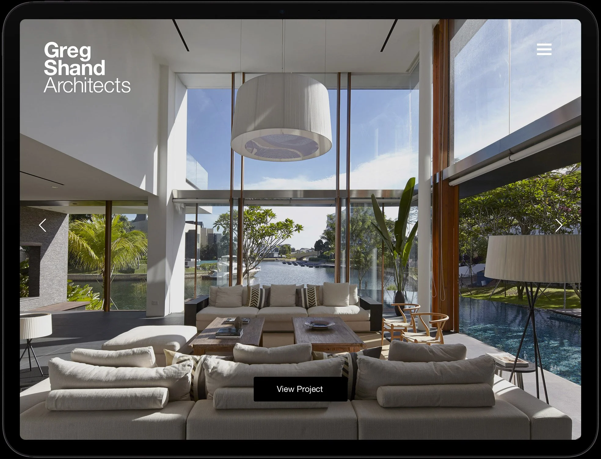
Website
Concept / Brand


Project Sheet
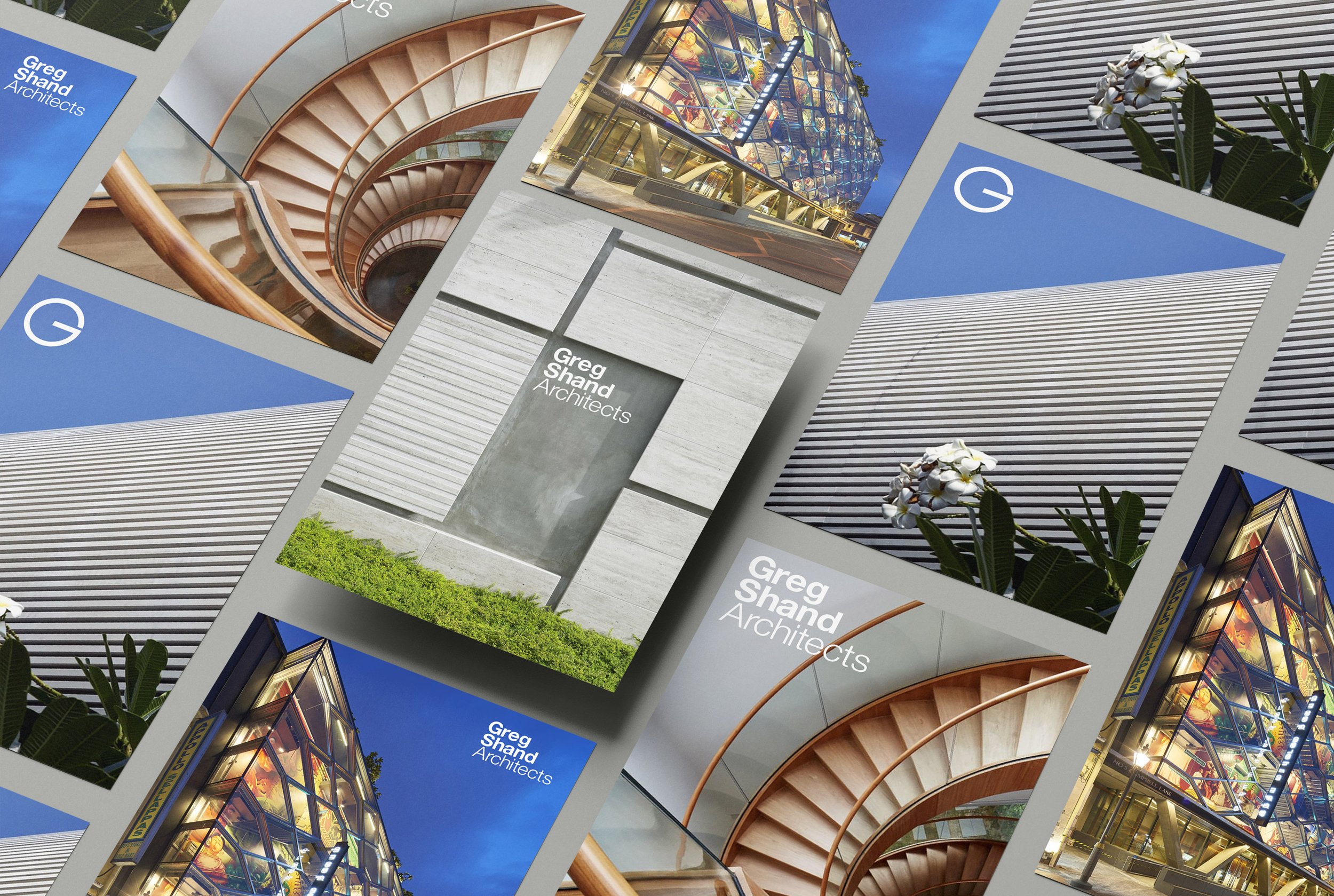
Promotional Flyers

Building Signage

Business Cards
Before / After
—
Results
The refreshed brand identity provided Greg Shand Architects with a more modern and cohesive presence, aligning with their architectural style. The bold ‘G’ logomark became instantly recognisable, adding strength and confidence to their brand. The refined typography and restrained design approach created a sense of clarity and professionalism, reinforcing their commitment to high-quality, sustainable architecture. With the new identity in place, their brand now feels more aligned with their values, helping them communicate their vision more effectively to clients and collaborators.